OutPut Fitness
Fitness Studio
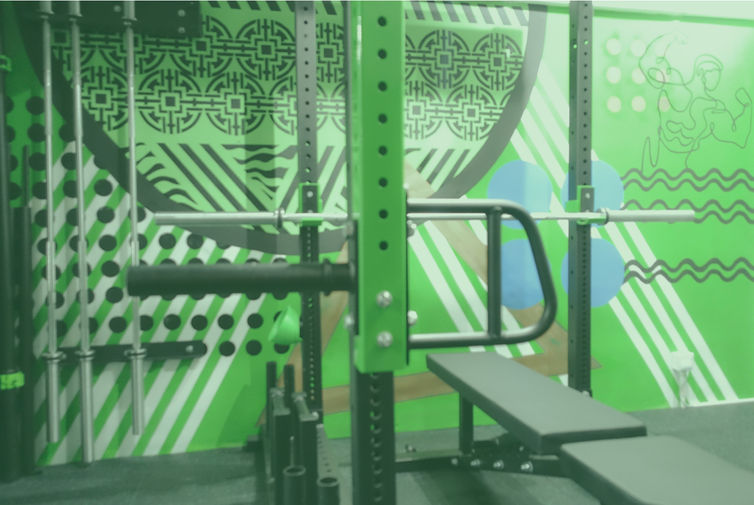
Output Fitness is a boutique gym located in Sheung Wan, Hong Kong, a trendy district, and local hotspot, the perfect place for a community driven fitness club with humble roots. To build this brand aesthetic, I embraced the surrounding culture, by design, and weaved OutPut’s presence seamlessly into the fold. The company’s ethos remains at the centre, of the gym’s interior design and as the corner stone of the digital presence I produced. “Output is motivated by strong hearts, community spirit and progress”.
I established themes of camaraderie, community based fitness and growth, and then selected an impactful correlating colour. The colour green symbolises health, abundance, and calm creating a positive environment for an invigorating experience. Next I chose bold lines and abstract artwork to represent the fusion of personal power and motivation with a nod to the vivid patterns of local Cantonese street artists. The ‘Strong Hearts’ slogan taking form throughout the feature wall design, and carrying through to sub-logos on merchandise and marketing materials. The logo itself, an icon of strength and a recognisable, adaptable brand signifier.

Brand
Website

.jpg)
Message
Socials


Materials
Merchandise


